Input Elements
These elements collect typed responses from your respondents — names, emails, numbers, dates, and more.Short Text
Short Text
A single-line text field for short answers.Use it for: Names, job titles, company names, or any brief free-text answer.Options:
- Mark as required
- Add a description or helper text
- Set placeholder text
- Set a minimum and/or maximum character length
- Add a validation pattern (regex) for custom format rules
Long Text
Long Text
A multi-line text field for longer responses.Use it for: Comments, feedback, detailed descriptions, or open-ended questions.Options: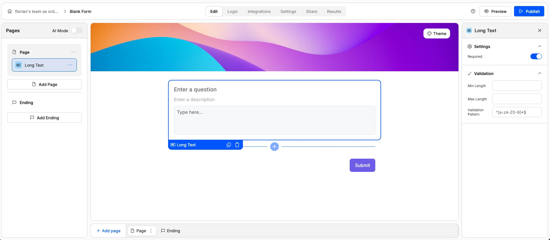
- Mark as required
- Add a description or helper text
- Set placeholder text
- Set a minimum and/or maximum character length
- Add a validation pattern (regex) for custom format rules
Number
Number
A field that only accepts numeric values.Use it for: Quantities, ages, budgets, headcounts, or any numerical answer.Options:
- Mark as required
- Add a description or helper text
- Set placeholder text
- Set a minimum and/or maximum value
- Add a validation pattern (regex) for custom format rules
Email
A text field with built-in email validation. Respondents must enter a properly formatted email address.Use it for: Collecting contact emails, newsletter signups, or account registration.Options:
- Mark as required
- Add a description or helper text
- Set placeholder text
- Set a minimum and/or maximum character length
- Add a validation pattern (regex) for custom format rules
Phone Number
Phone Number
A field for collecting phone numbers.Use it for: Contact forms, booking forms, or any scenario where you need a phone number.Options: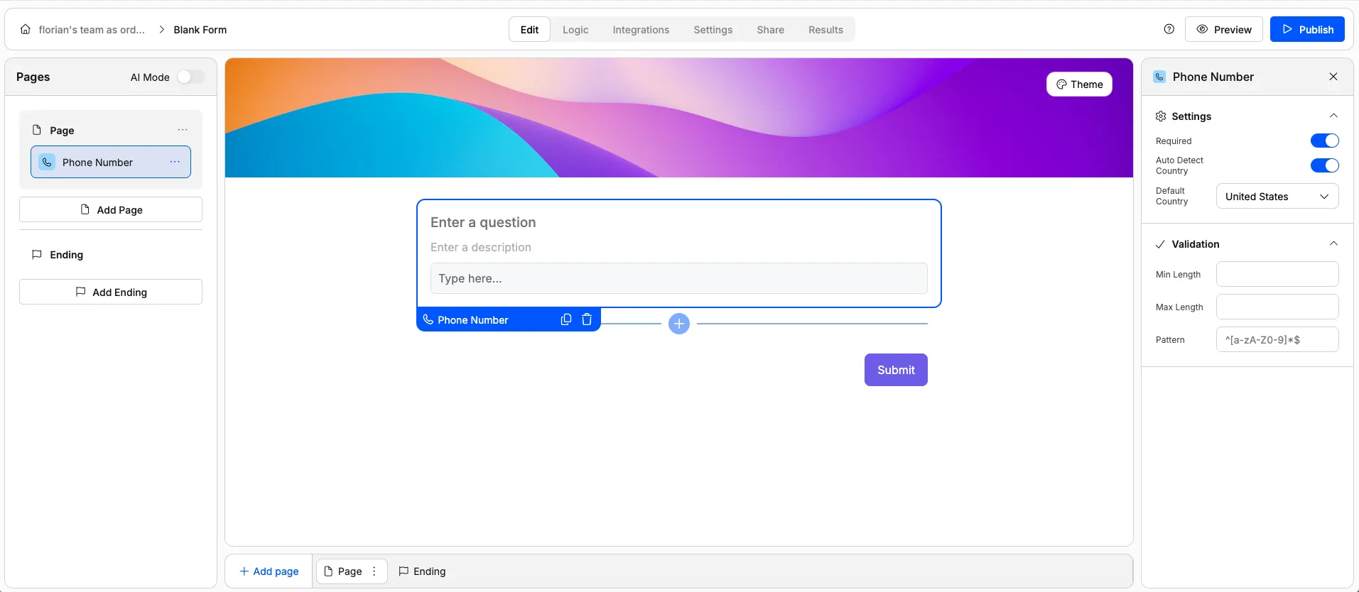
- Mark as required
- Add a description or helper text
- Set placeholder text
- Enable/disable auto-detection of respondent country
- Set default country code
- Set a minimum and/or maximum character length
- Add a validation pattern (regex) for custom format rules
URL
URL
A text field with URL validation. Respondents must enter a valid web address (must start with http:// or https:// followed by a domain).Use it for: Collecting website links, portfolio URLs, social media profiles, or LinkedIn pages.Options: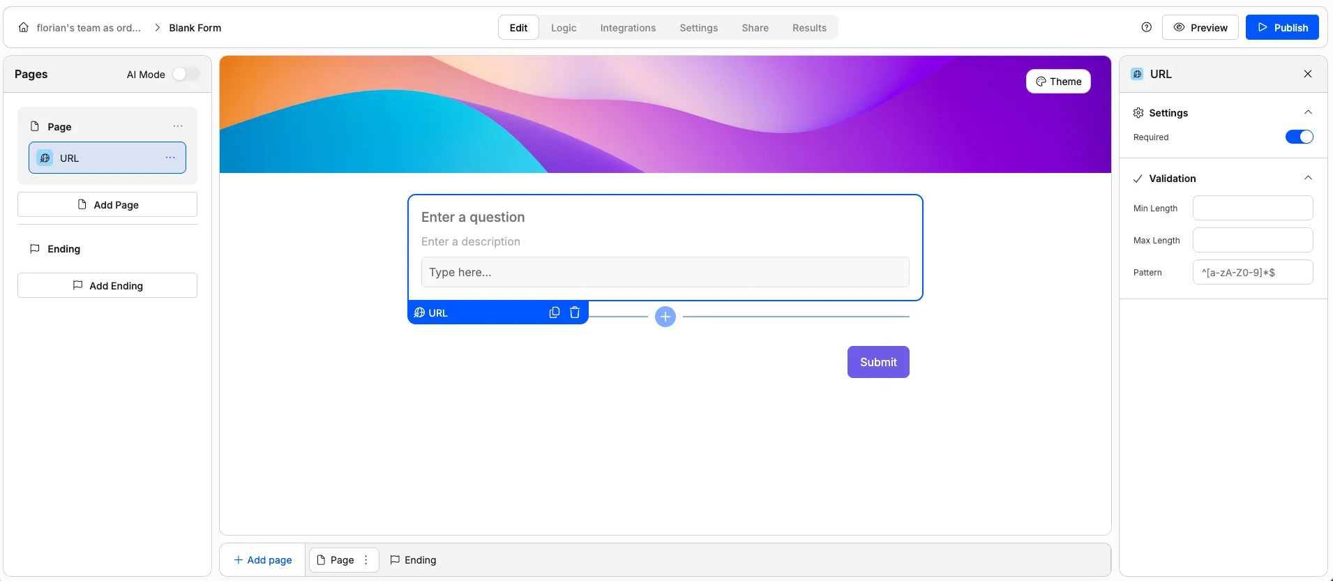
- Mark as required
- Add a description or helper text
- Set placeholder text
- Add a validation pattern (regex) for custom format rules
Date Picker
Date Picker
A calendar-style picker that lets respondents select a date.Use it for: Booking dates, event registration, deadlines, or dates of birth.Options:
- Mark as required
- Add a description or helper text
- Set an earliest and/or latest allowed date
Time
Time
A picker for selecting a specific time.Use it for: Appointment scheduling, preferred contact times, or event start times.Options:
- Mark as required
- Add a description or helper text
- Set an earliest and/or latest allowed time
File Upload
File Upload
Lets respondents upload one or more files directly through the form.Use it for: Resumes, images, documents, portfolios, or any file attachment.Options: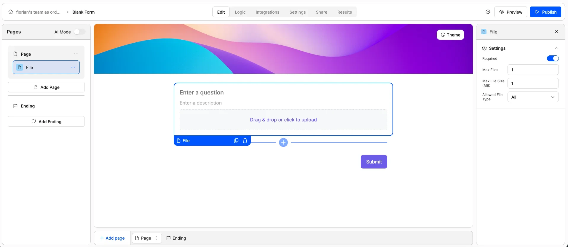
- Mark as required
- Limit the number of files allowed
- Set a maximum file size
- Restrict accepted file types (e.g. PDFs only, images only)
- Add a description or helper text
Choice Elements
These elements let respondents pick from a set of predefined options.Single Choice
Single Choice
A list of options where respondents choose exactly one. Only one option can be selected at a time.Use it for: Yes/no questions, preference picks, or any question with mutually exclusive answers.Options: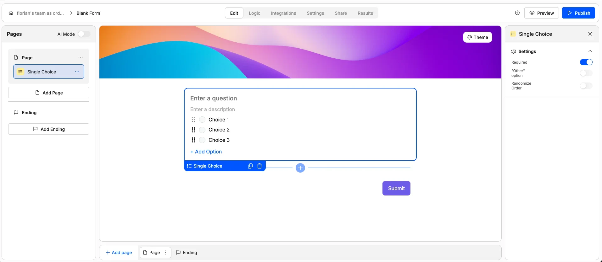
- Mark as required
- Randomize option order
- Add an “Other” option with a free-text field
- Customise the “Other” option label
Multiple Choice
Multiple Choice
A list of options where respondents can select multiple answers.Use it for: “Select all that apply” questions, interest lists, or feature preferences.Options: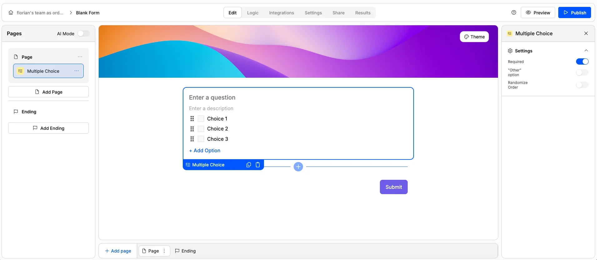
- Mark as required
- Randomize option order
- Add an “Other” option with a free-text field
- Customise the “Other” option label
Dropdown
Dropdown
A compact dropdown menu for selecting a single option. The options are hidden until the respondent clicks to expand the list.Use it for: Long lists of options (countries, categories, departments) where radio buttons would take up too much space.Options:
- Mark as required
- Randomize option order
Image Choice
Image Choice
A visual selection element where each option is represented by an image. Respondents click on an image to select it.Use it for: Design preferences, product picks, mood boards, or any visual comparison.Options: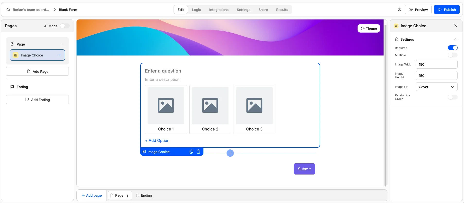
- Mark as required
- Allow single or multiple selection
- Randomize option order
- Set image dimensions and fit
Checkbox
Checkbox
A standalone checkbox — checked or unchecked.Use it for: Terms and conditions agreements, opt-ins, consent confirmations, or any yes/no toggle.Options: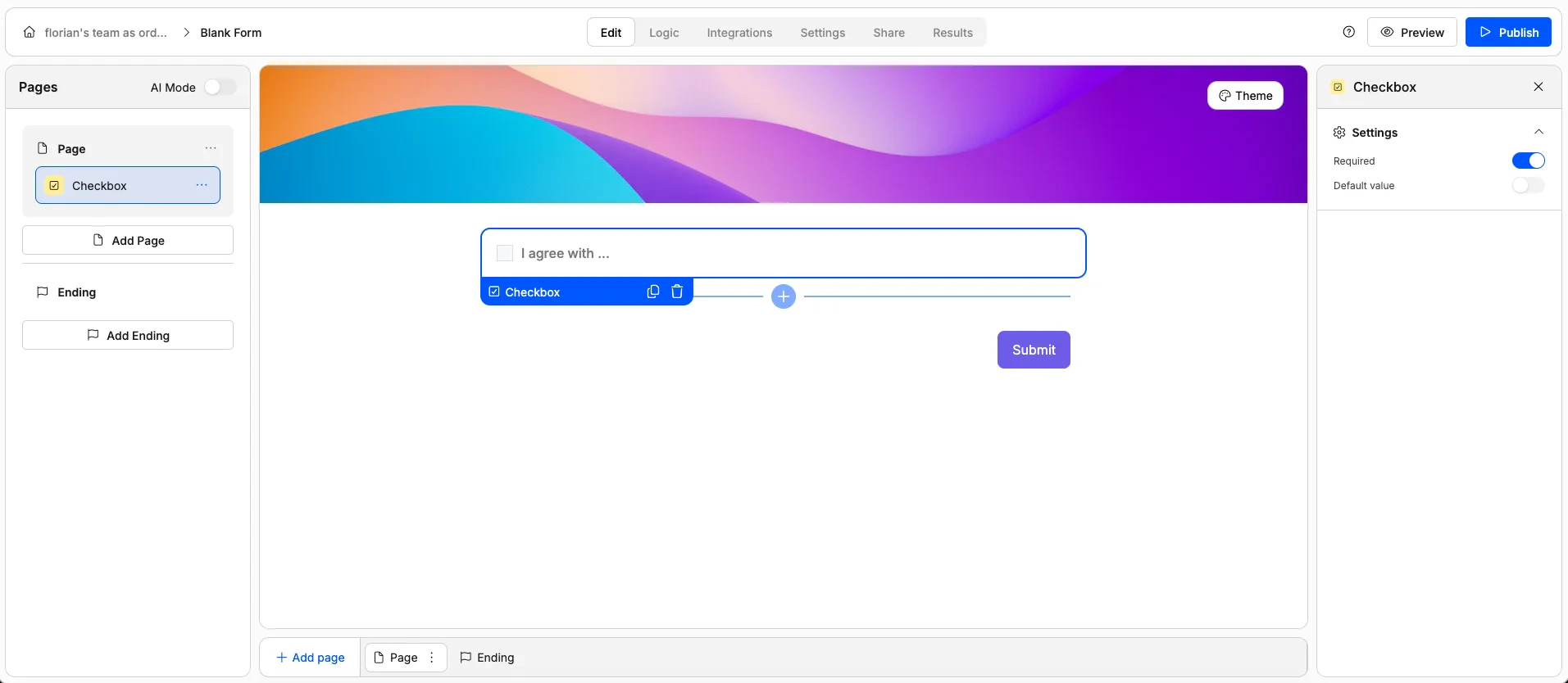
- Mark as required (respondent must check the box)
- Set whether it’s pre-checked by default
Matrix
Matrix
A grid where rows represent sub-questions and columns represent answer options. Each row is answered independently using the same set of choices.Use it for: Likert scales, multi-criteria evaluations, satisfaction surveys, or comparing multiple items on the same scale.Options: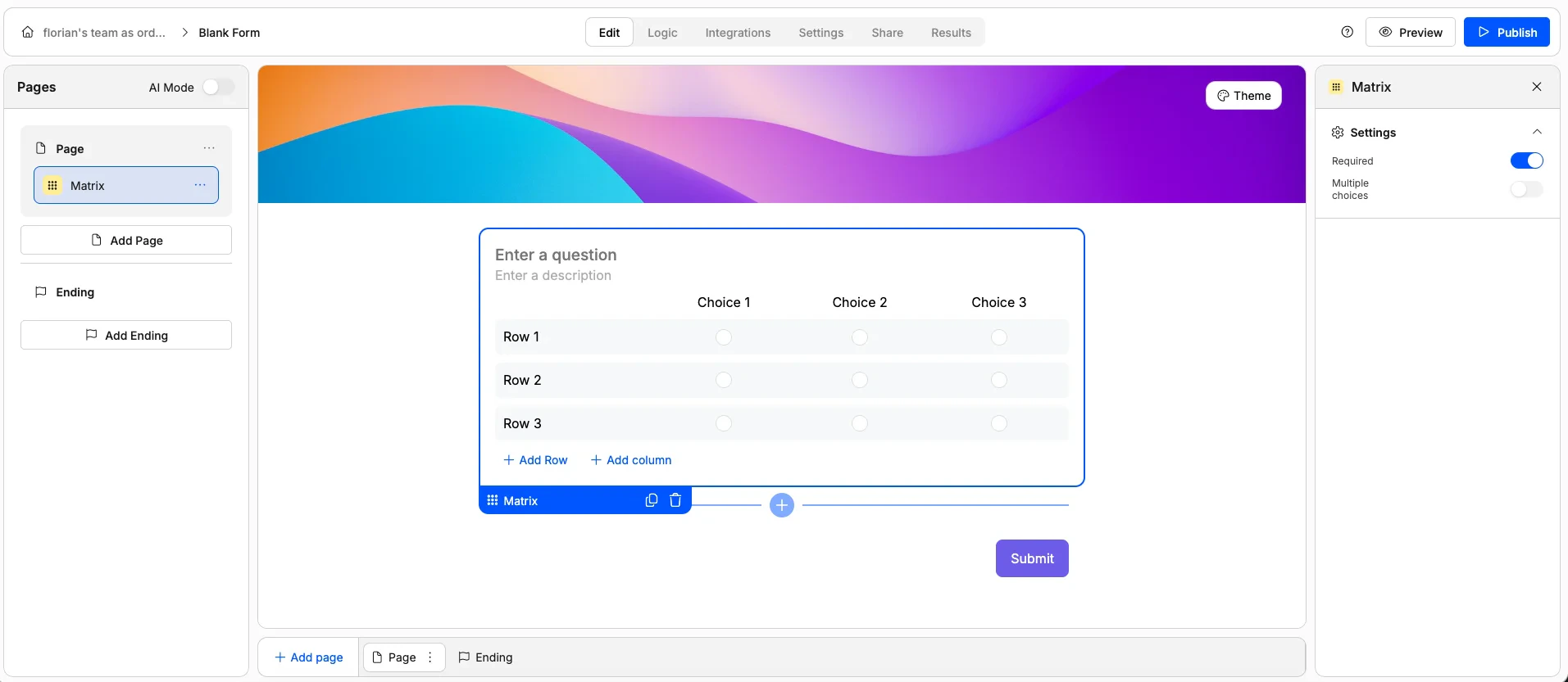
- Mark as required
- Allow single or multiple selections per row
Rating Elements
These elements let respondents express a score or level of satisfaction.Ranking
Ranking
A drag-and-drop element where respondents reorder items by preference or priority.Use it for: Prioritisation exercises, feature rankings, or preference ordering.Options: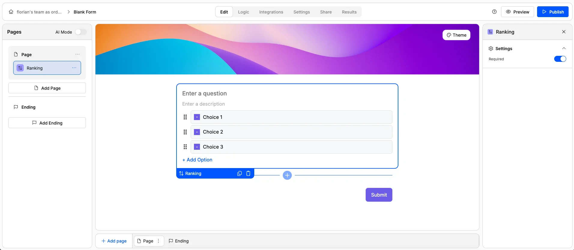
- Mark as required
Star Rating
Star Rating
A familiar star-based rating. Respondents click to select a number of stars.Use it for: Product reviews, experience ratings, satisfaction scores, or any quick quality assessment.Options: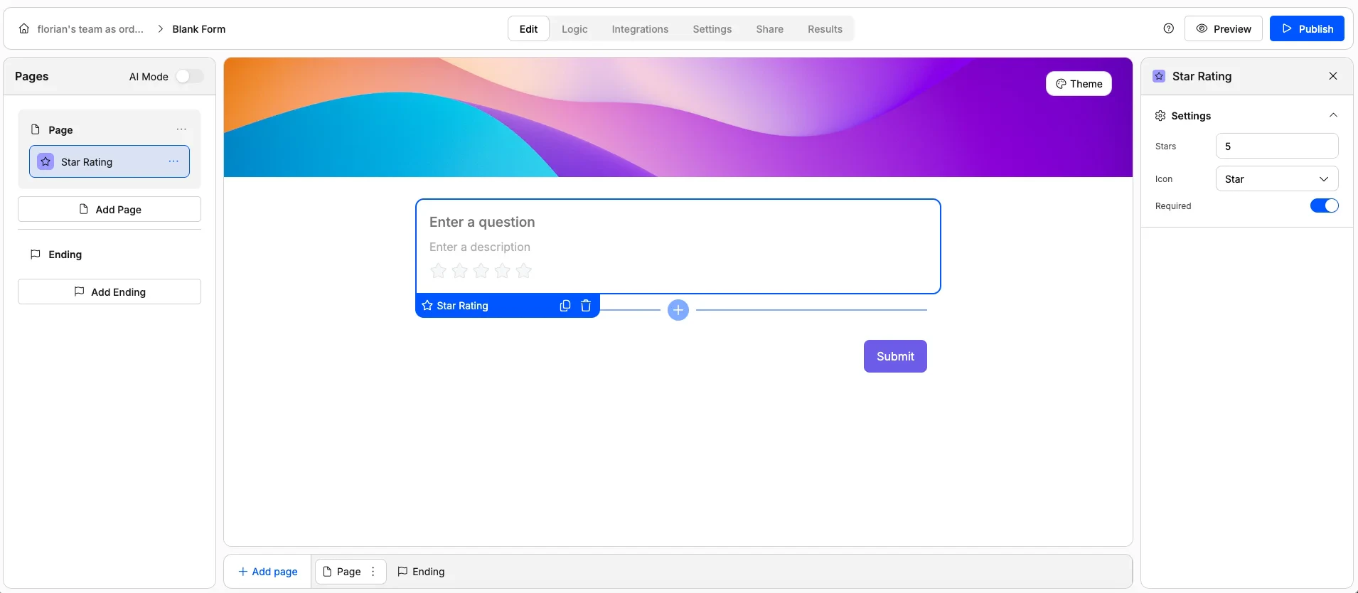
- Mark as required
- Set the number of stars (e.g. 5 or 10)
- Change the icon (use hearts, thumbs up, or other icons instead of stars)
Scale Rating
Scale Rating
A numeric scale where respondents pick a number (e.g. 0–10). Often used for NPS (Net Promoter Score) surveys.Use it for: NPS surveys, satisfaction scores, likelihood scales, or effort scores.Options: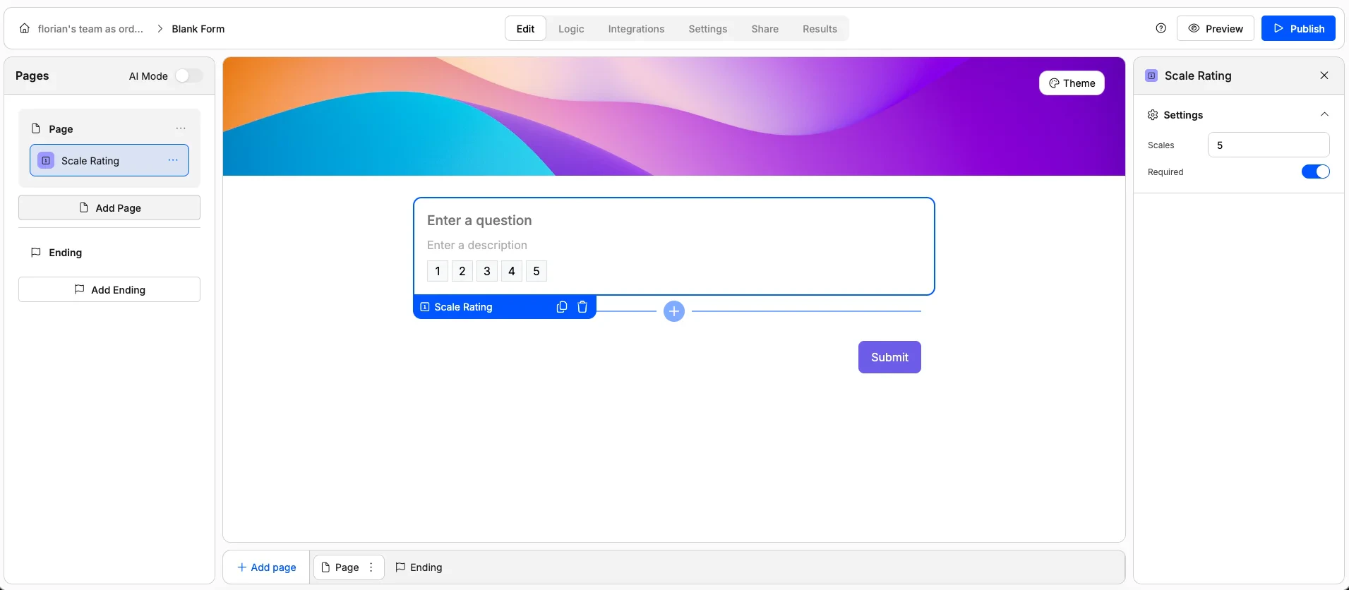
- Mark as required
- Set the number of scale points
Range Slider
Range Slider
A draggable slider for selecting a value within a defined range.Use it for: Budgets, price ranges, temperature preferences, or any continuous numeric value.Options: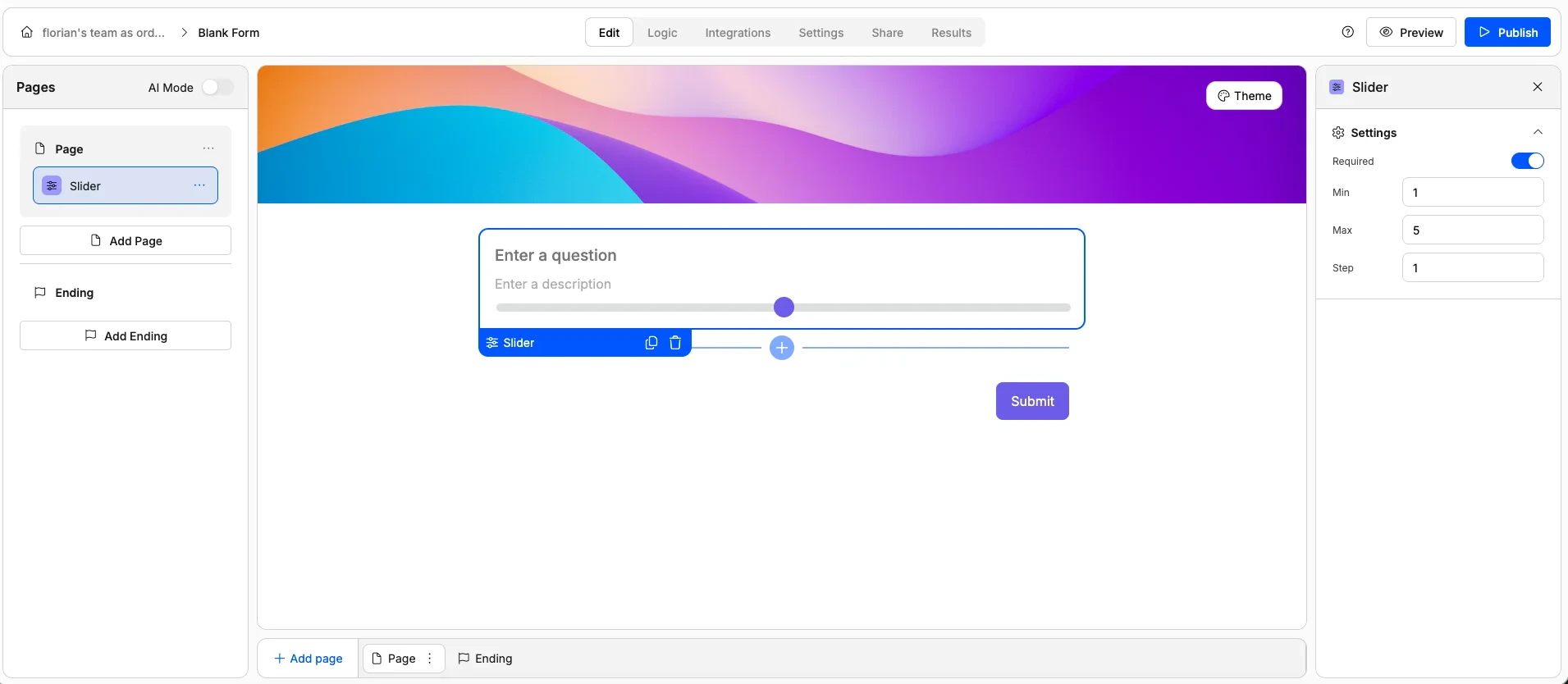
- Set minimum and maximum values
- Set the step size (e.g. increments of 10, 100, or 500)
Display Elements
Display elements don’t collect responses — they add structure, context, and media to your form.Heading
Heading
A large text heading for creating visual sections within your form.Use it for: Section titles, page headers, or visual breaks between groups of questions.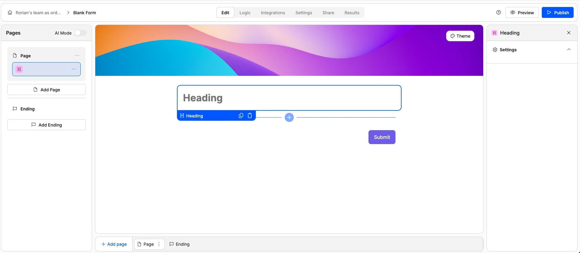
Paragraph
Paragraph
A block of text for adding instructions, explanations, or contextual information. Supports rich text formatting and answer piping to dynamically insert a respondent’s earlier answers.Use it for: Instructions, welcome messages, disclaimers, or personalised text using answer piping.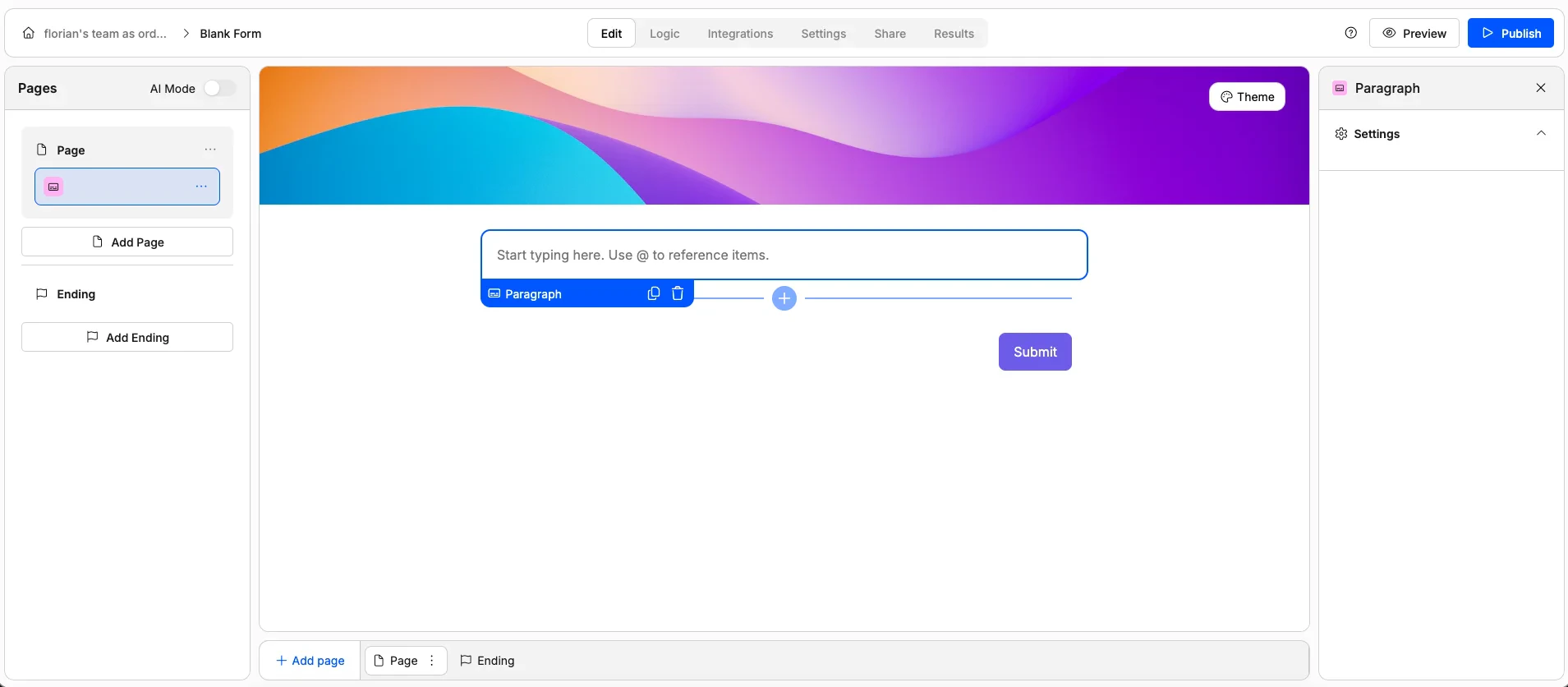
Image
Image
Displays an image on the form.Use it for: Reference photos, diagrams, or any visual context.Options: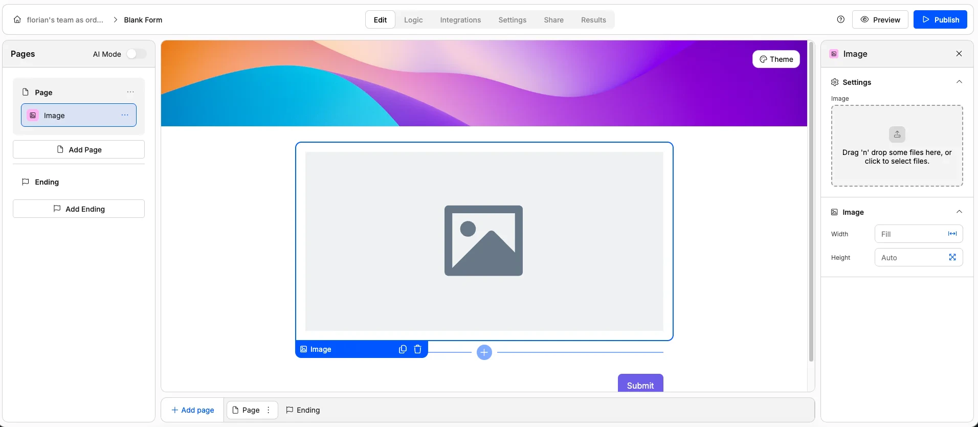
- Set image width and height
Embed HTML
Embed HTML
Embeds a custom HTML snippet directly into your form.Use it for: Third-party widgets, custom styling, embedded maps, or anything not covered by the other elements.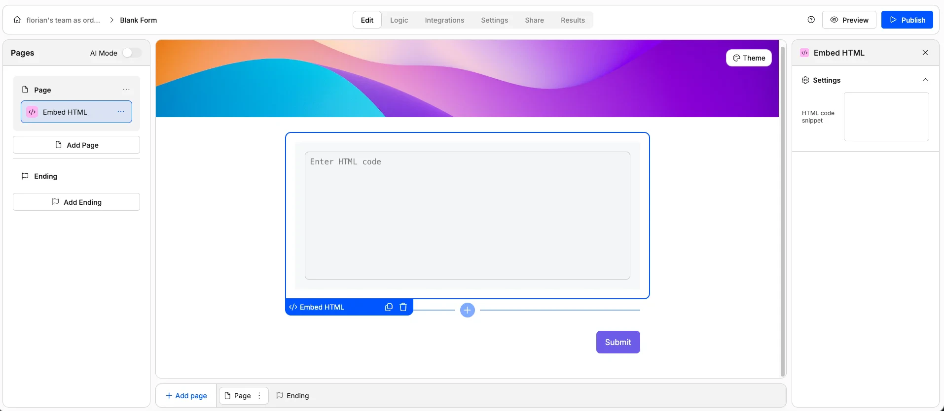
Audio Embed
Audio Embed
An audio player embedded in your form.Use it for: Podcasts, voice instructions, music samples, or audio feedback prompts.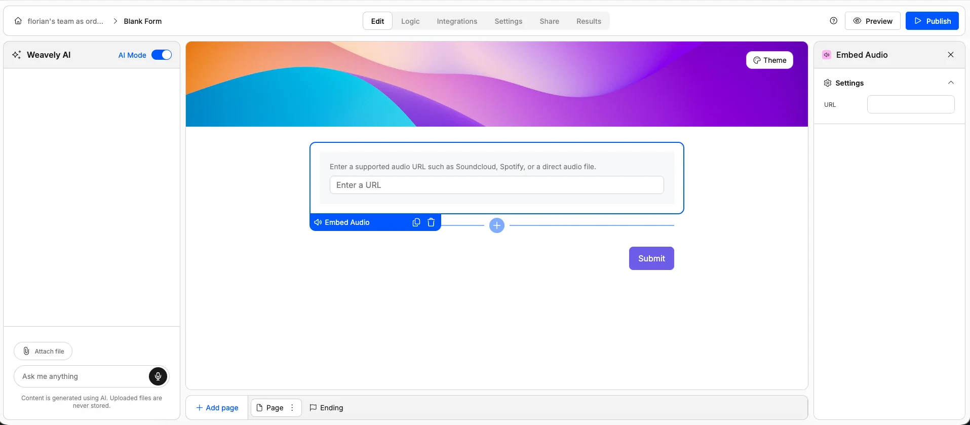
Video Embed
Video Embed
A video player embedded in your form. Supports YouTube, Vimeo, and other hosted video URLs.Use it for: Tutorial videos, product demos, welcome messages, or any video content.
Special Elements
Signature
Signature
A digital signature pad where respondents draw their signature using a mouse, trackpad, or finger on mobile.Use it for: Contracts, consent forms, waivers, delivery confirmations, or any document that needs a signature.Options: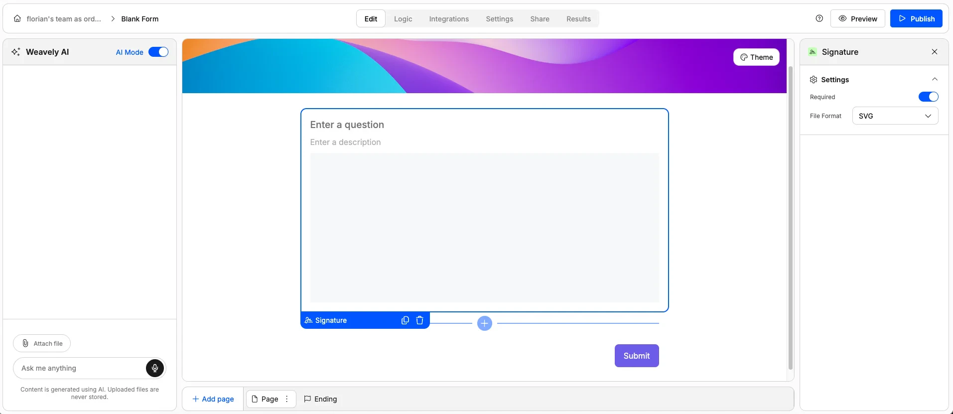
- Mark as required
- Set the output file format
Related
Skip-page Logic
Show or hide elements and pages based on how respondents answer.
Answer Piping
Dynamically insert earlier answers into later questions or text.
Field Validation
Add custom validation rules to your form fields.
Quizzes
Turn your form into a scored quiz with correct answers and feedback.